


Framed or unframed, desk size to sofa size, printed by us in Arizona and Alabama since 2007. Explore now.
Shorpy is funded by you. Patreon contributors get an ad-free experience.
Learn more.


- Give Me Wings Please!
- Does a leading question need a destination sign?
- PRR
- Pinball Wizards
- Possible anti-dancing rationale
- Life imitates art
- Don't dance to the Packard!
- Delight is in the details
- Why not just have a jukebox?
- Baked goods to go
- Tires
- It'll be a cold day in hell
- A Certain Robot
- Still Standing
- All wound up?
- Springy
- This one is inspirational.
- Seasonal Work
- Tomaeto, Tomahto
- Truck ID
- Horton Hears a ...
- From a buggy company came ...
- They call me Mister Horton
- Still Run
- Someone fed Jack some bad info.
- A Beautiful Machine
- It's official.
- Olive Brand Sportswear
- I still have a grudge against Texaco
- No GPS?
Photos submitted by Shorpy members!
Printporium
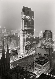
TWA: 1964

Circa 1964. "Trans World Airlines Terminal. Idlewild Airport, Queens, New York." Acetate negative by Balthazar Korab (1926-2013), Hungarian-born architectural photographer who documented the work of Eero Saarinen. View full size.
Architecture
Sculpture you can walk about in; this is a prime example.
Looking at this
I wish M. C. Escher had been an architect.
Red and white
Red and white were TWA's colors. That was probably a major factor in the palette Saarinen used.
Futuristic interiors
always look better without people!
Word builder too
Not only did Saarinen design beautiful structures, he is always welcome to see as a clue when one tries to "build" the New York Times crossword.
Pan Am terminal
My parents and I flew on Pan Am to Europe in 62, I thought the TWA terminal was really gorgeous and so futuristic, that I wished we flew on TWA instead. Although the Pan AM terminal was really nice as well.
Come Fly With Me!
This is when travel, especially international air travel, was actually fun and glamorous. You got a (relatively edible) meal on the plane. The passengers actually got dressed up. The planes themselves were more comfortable. (That's right - the airplanes of half a century ago were more physically comfortable than their 21st century cousins are today.) And walking through the soaring architecture of Idlewild/JFK only enhanced the whole experience.
Today? Grab a sandwich in the food court after you've been x-rayed and strip searched. Hope against hope that you don't get stuck in a middle seat next to some dude wearing flip flops and a tank top. Cram all your bags in the overhead in order to save a few bucks on the luggage surcharge. And then try to sleep through as much of the dreadful experience as you can.
Meet George Jetson
Amazing architecture. Even the ashtrays look like they're from the 23rd century!
Color!
Here's a couple of contemporary renderings of the interior, they give the flavor of it pretty well.
No question that Saarinen was strongly influenced by the German Expressionists, especially at TWA, but I suspect the strong colors were his own response to the sixties.


Deja vu
Makes me think of the outside of the Einstein Tower in Potsdam. Not nearly as scary looking though. :eek:
Monochrome?
This would be so much better in color. No reason a photo like this should be just shades of gray in 1964.
I remember it well
I flew in and out of JFK on TWA many times in the late 80s, and I always looked forward to passing through this building. It was one of the few perks left for TWA passengers in its declining years. The photo is fantastic, but you have to realize that the carpeting and the upholstery in here is RED - and that changes one's impression of the place quite a bit. This building has to be one of Eero Saarinen's greatest hits!
Wait!
Where are the metal detectors and full-body patdown lanes?
It still looked great
20 years after it opened. I flew through there several times in the 1980s and 90s, and loved looking at its features every time.
Right out of Mad Men
We were lucky last year when we chanced to be flying out on Jet Blue, which is now connected to this terminal. That particular day the TWA terminal was open to the public. It was like going back into time and I am so pleased that it has been preserved and restored. I can only hope that the same is done with the Pan Am Wordport. Join the Facebook page "Save The Pan Am Wordport" and support the group's effort.
Here's a shot of TWA I posted to Facebook.
[Worthy competitor to Trans Word Airlines. -Dave]

On Shorpy:
Today’s Top 5